We created a new responsive interface design for the Architectural Services Department (ArchSD) in cooperation with their development and innovation in the challenging times.
The website not only showcases the vision, mission and values of ArchSD, but also provides general information and reference materials about their services. It can also work as a useful platform for users to send feedback and suggestions.
By revamping the new website of ArchSD, we hoped to combine the concept of ''people-orientated'' , ''professionalism'' and ''innovation'' with the stripped down and modern style of UI. Providing users a quality, simple and convenient user experience to increase their enjoyment and efficiency when surfing the website.

Original website - Dull and traditional default interface, which was lack of design
Original website was mostly text-heavy with low-resolution images. It was difficult and inefficient to promote ArchSD professionalism as well as its service content.
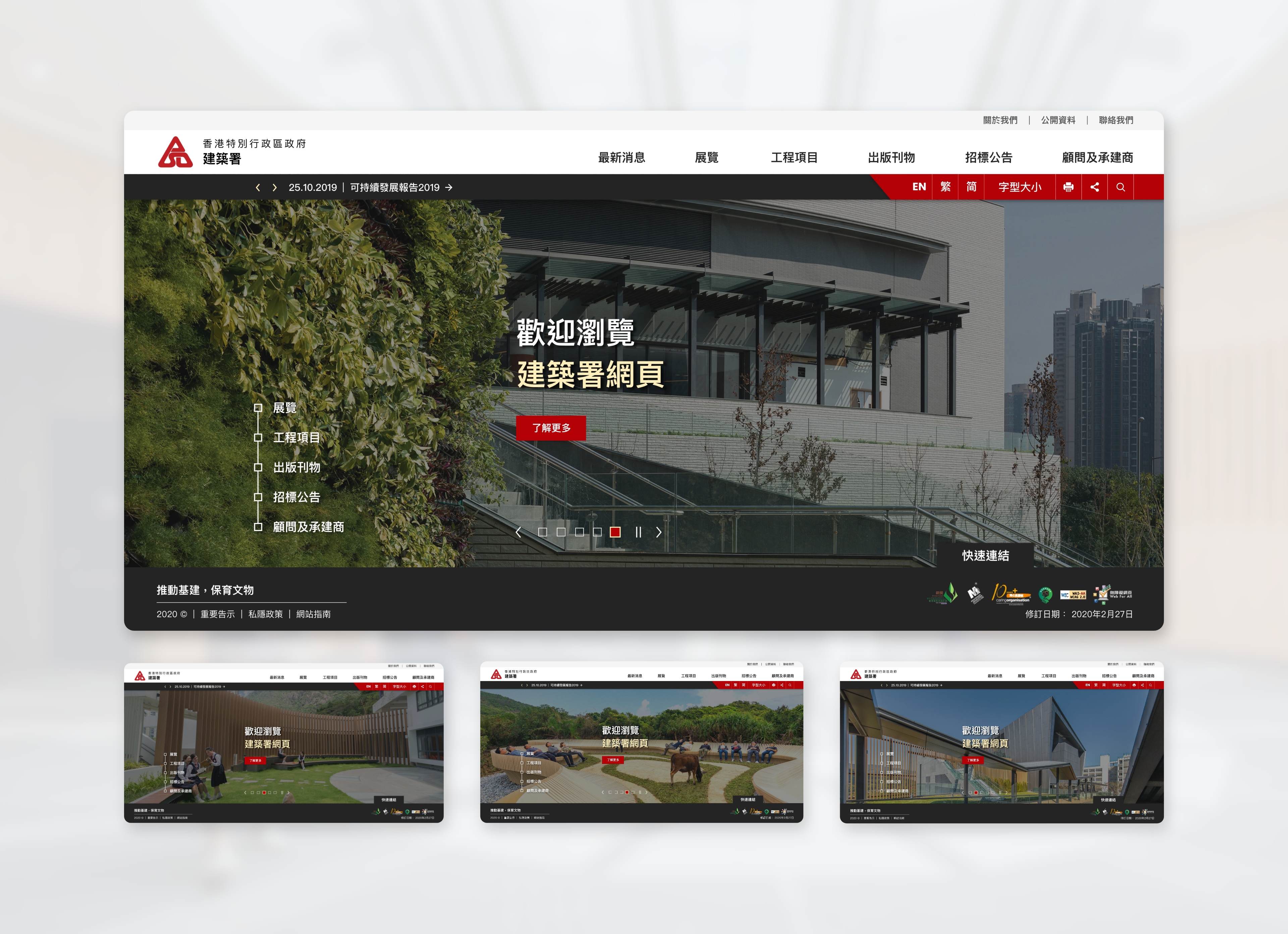
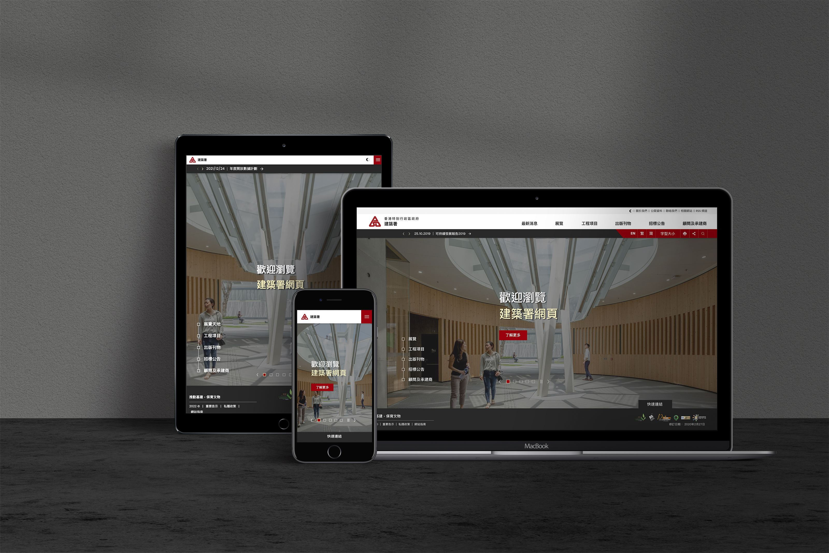
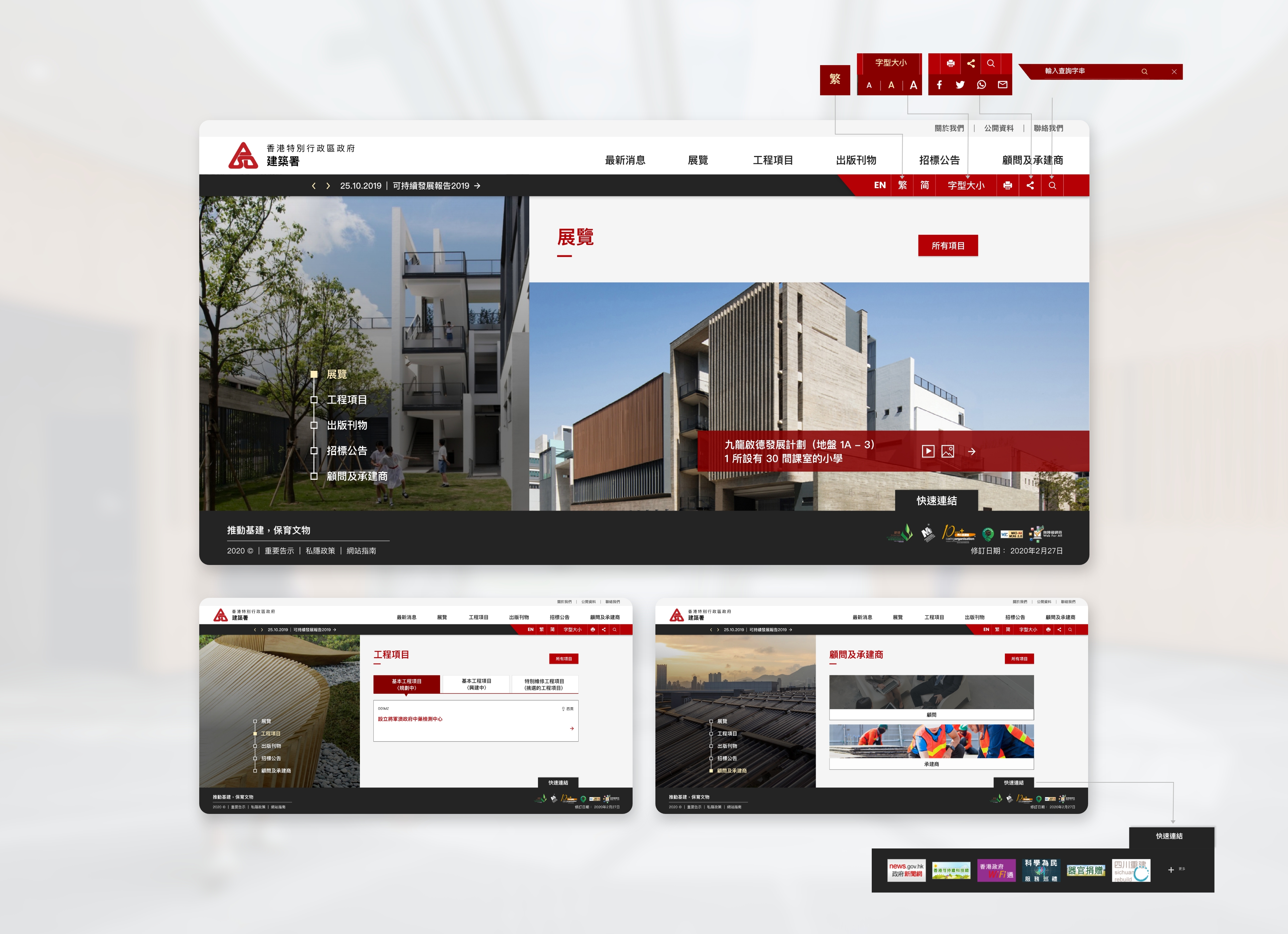
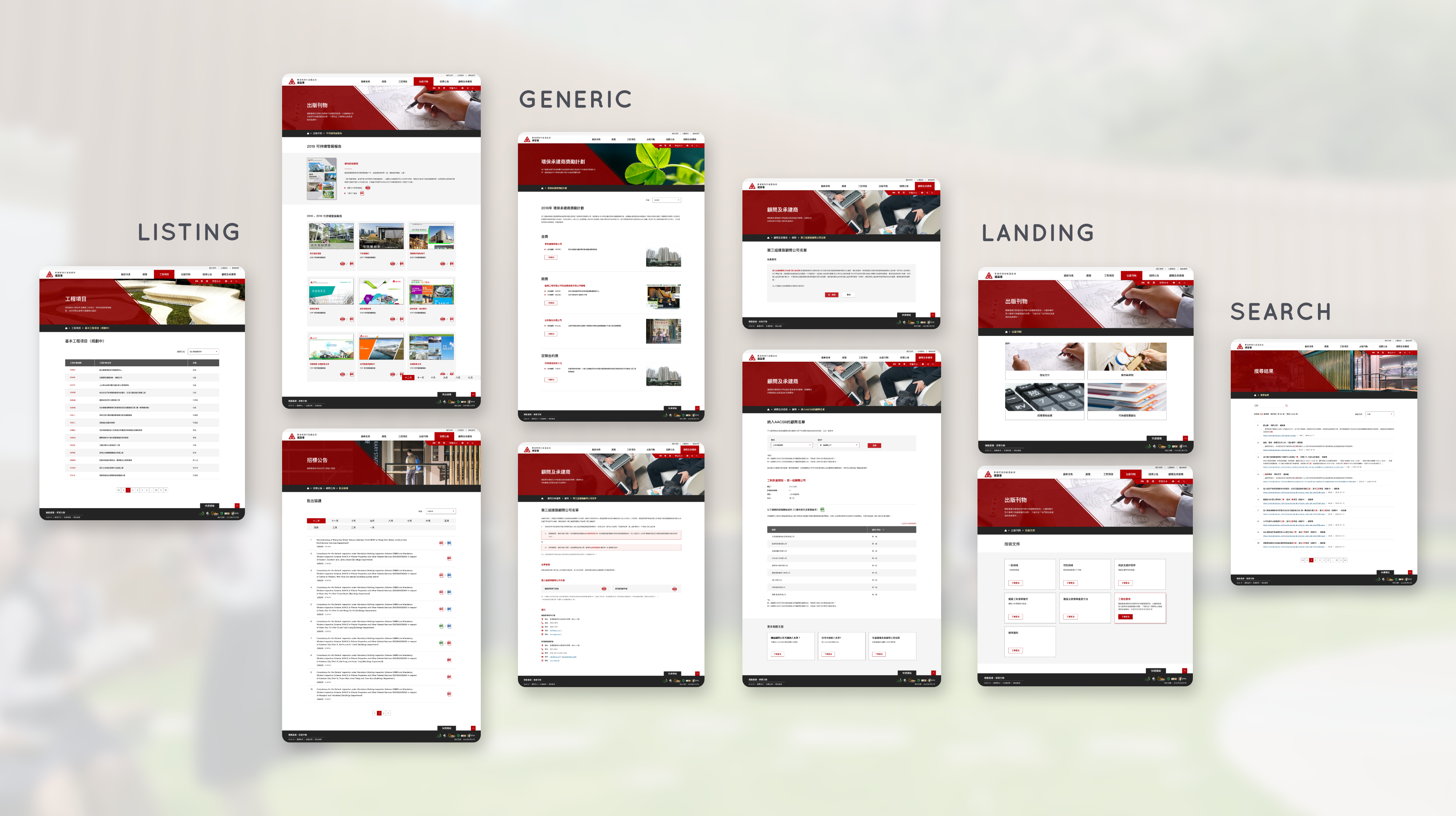
Homepage
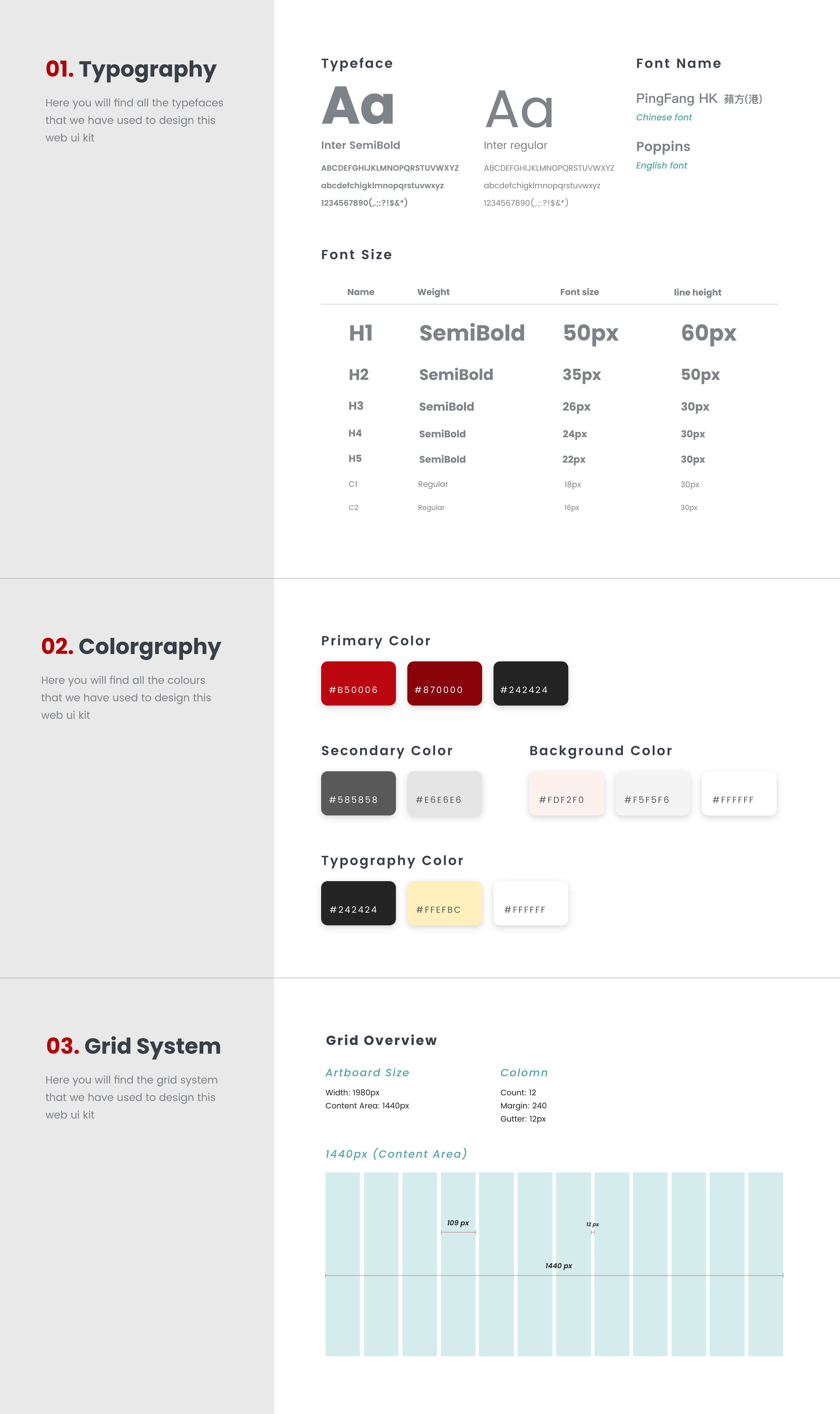
Color Elements
The red, dark gray, and light gray colours were used as the main colors that correspond to the ArchSD logo. Blocks are used as elements that seem like stack components like buildings.
KEY VISUAL
We used photos as the main key visual (e.g. a large photo slider with autoplay was used as the key visual on the homepage). It draws the users' attention and creates a professional and atmospheric feeling.
The inside page of each section contains a top photo banner.
Photo selection
Referring to the opinions of the client, we prefered choosing some photos of citizens interacting with the building, plus some relatively close photos to the citizens to be more vivid.
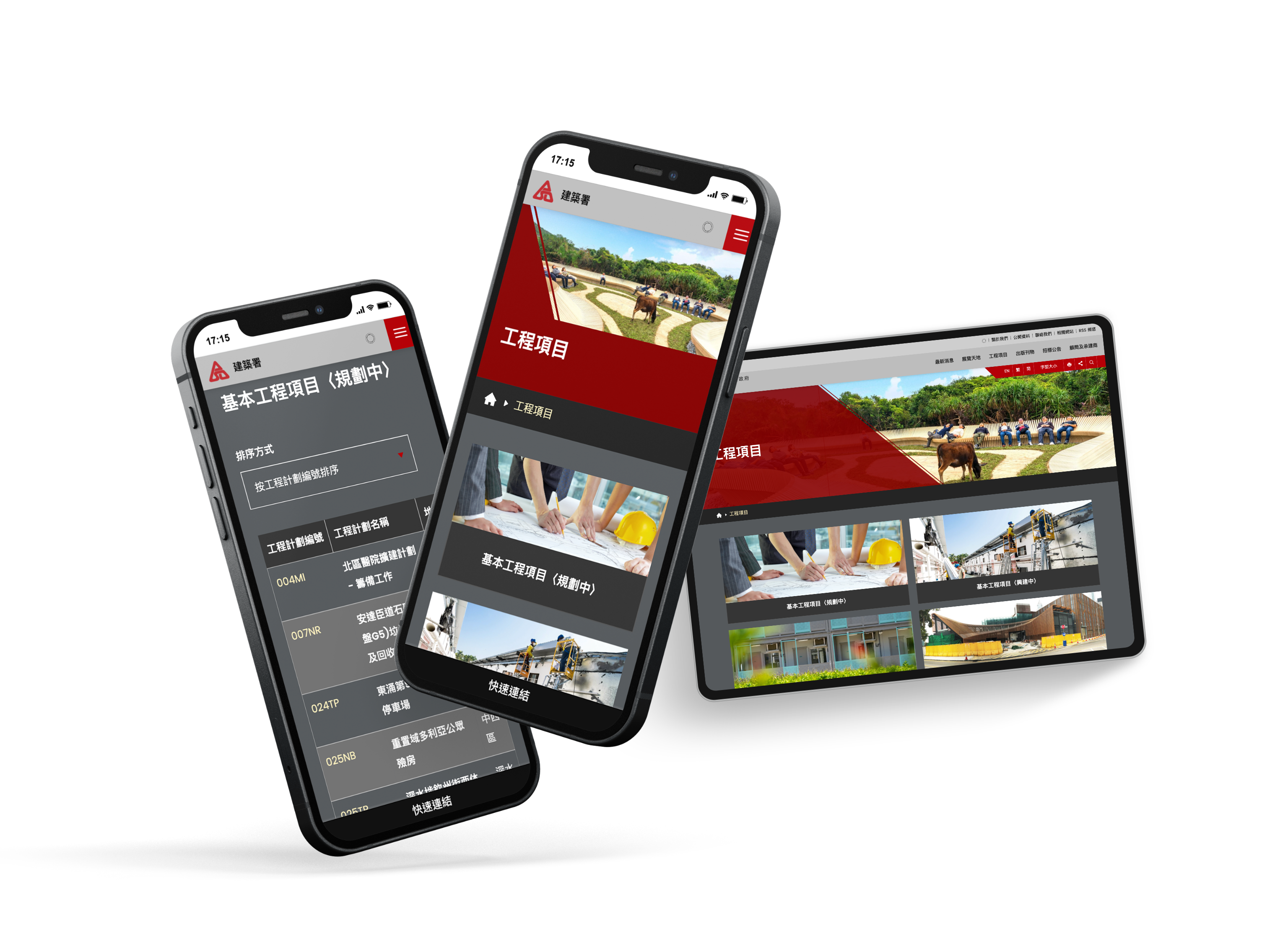
Horizontal view in the desktop version
For the desktop version, the homepage used a different presentation form from other government websites. It adopts a horizontal view, so that users do not have to scroll down to read the content as soon as they enter the website.
Highlighting five key categories related in the lower left corner
It guide the users’ eye to a particular piece of information that ArchSD key projects, through the checkered timeline button.
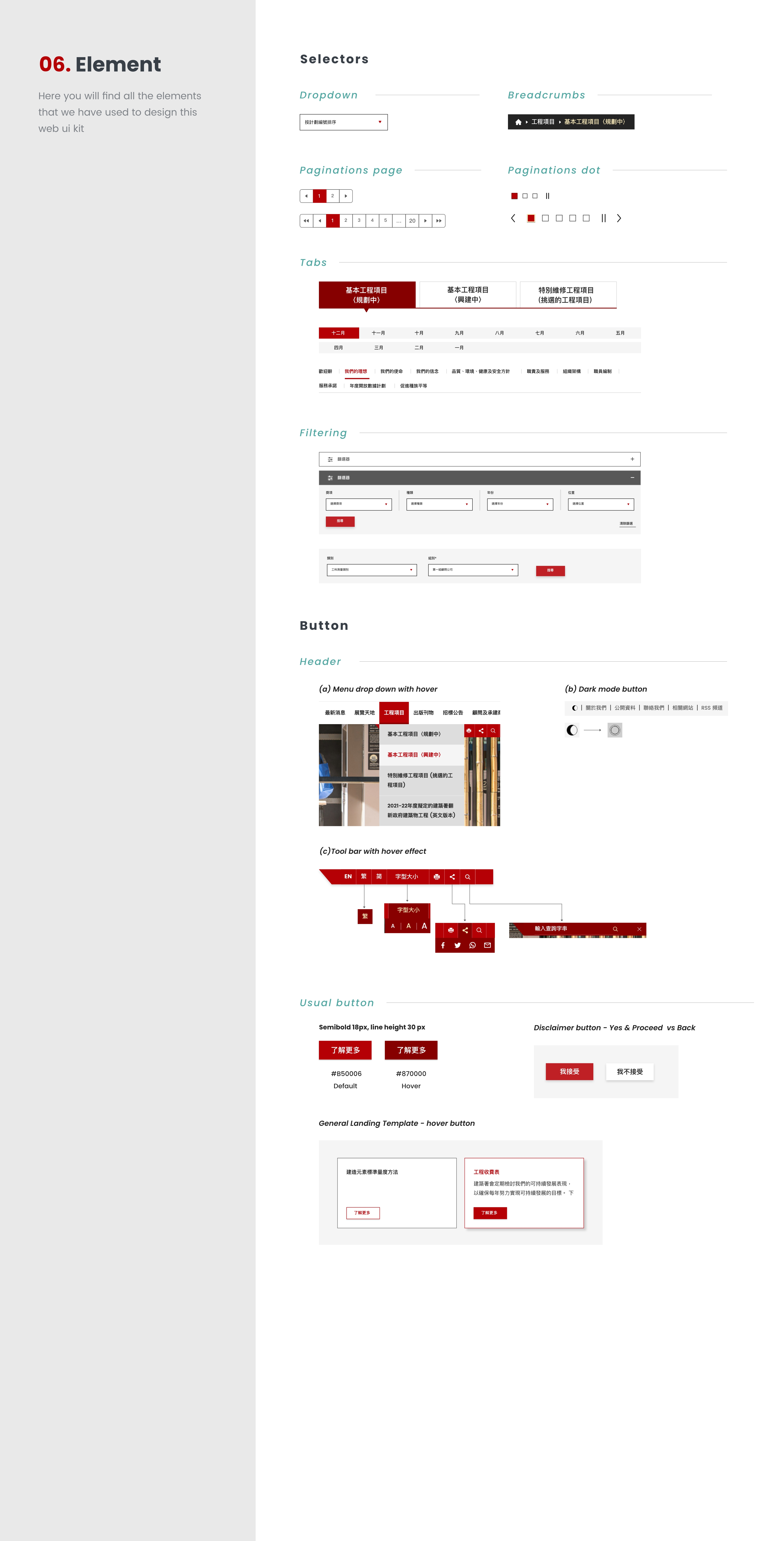
Convenient button tools
In the header part, there is a line of red button tool in the upper right corner (including language, font size, printing, share and search), a quick link button in the lower right stick to the footer, which allows users to quickly select, and open only the button content when necessary, relatively less space-consuming.
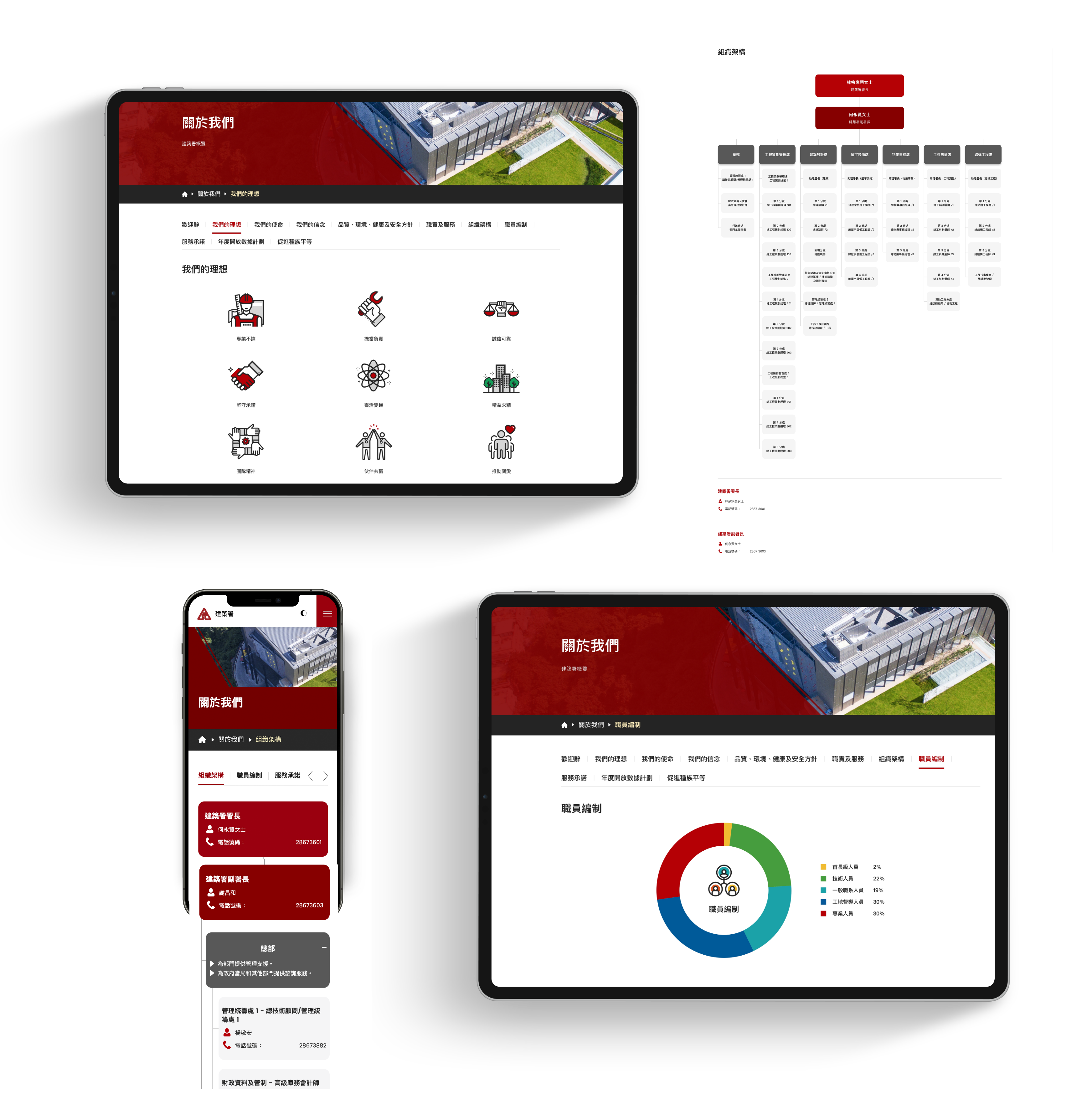
About Us
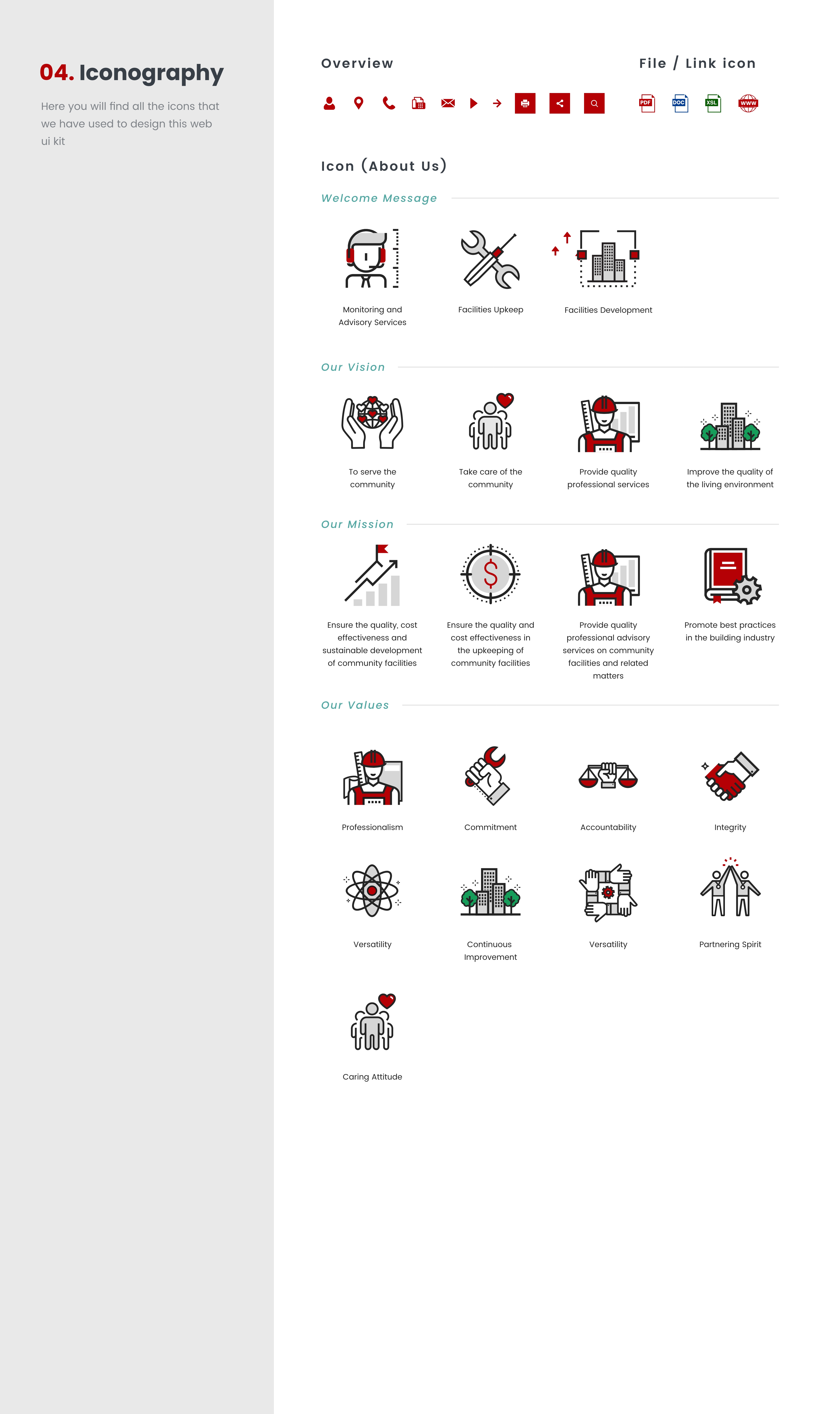
Icon & graphic design
In the ''About Us'' page, a series of flat line icons have been designed according to the characteristics of ArchSD. Illustrations have also been redesigned for some pages.
Responsive charts design with hover effect
Charts design of ‘’Staff Establishment’’ and ‘’Organisation Structure’’
Photo selection
Referring to the opinions of the client, we prefered choosing some photos of citizens interacting with the building, plus some relatively close photos to the citizens to be more vivid.
Original website - Scattered layout and orientation hinders user experience
The overall layout and orientation of the original website are scattered. There are no distinctive differences between the priorities of the pages, which makes it difficult to identify which pages are more important and need to be browsed first. However, all files or web links mostly use text hyperlinks (text with underline only), which are not clearly classified. The flow of user browsing is not smooth.
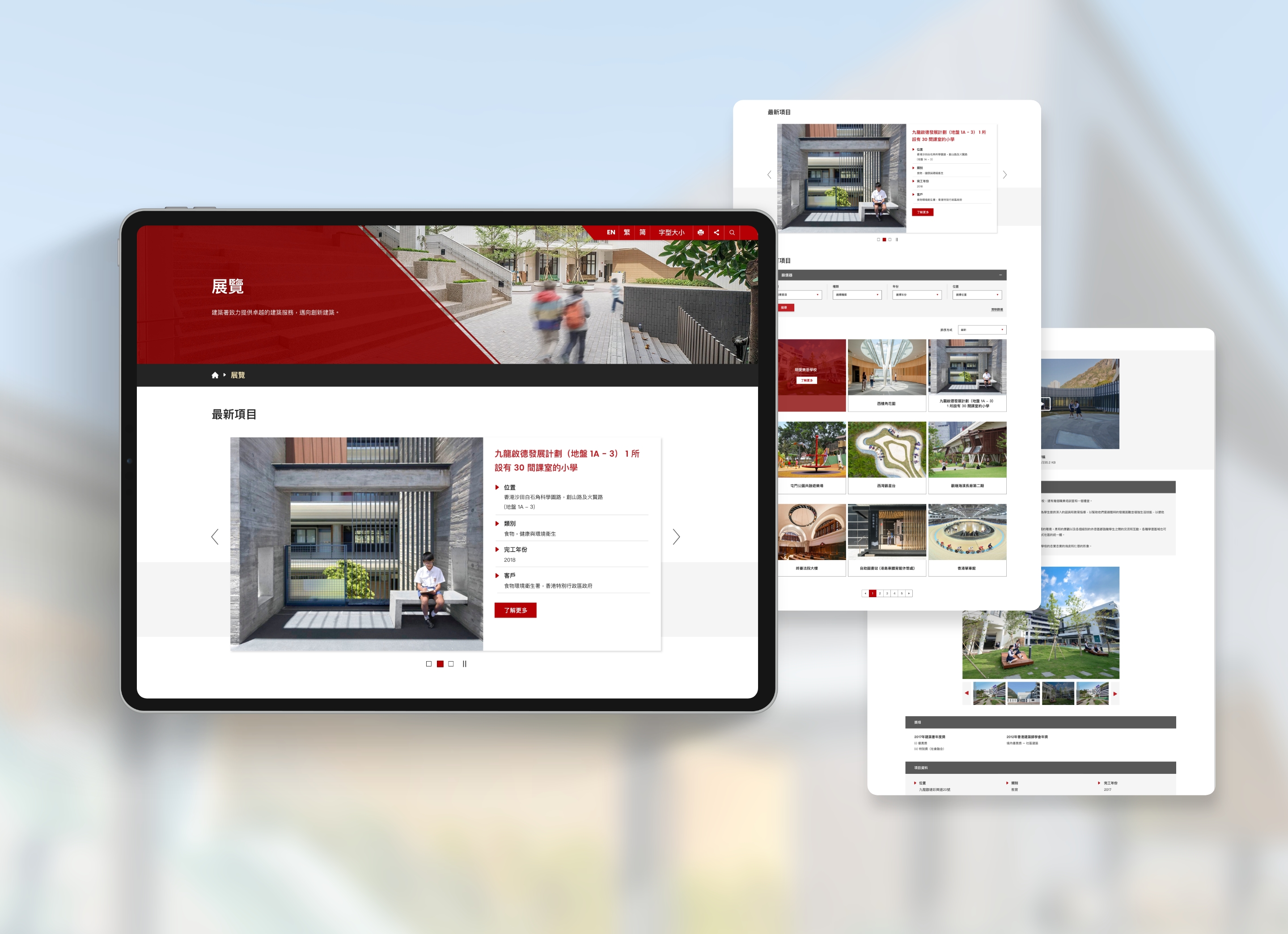
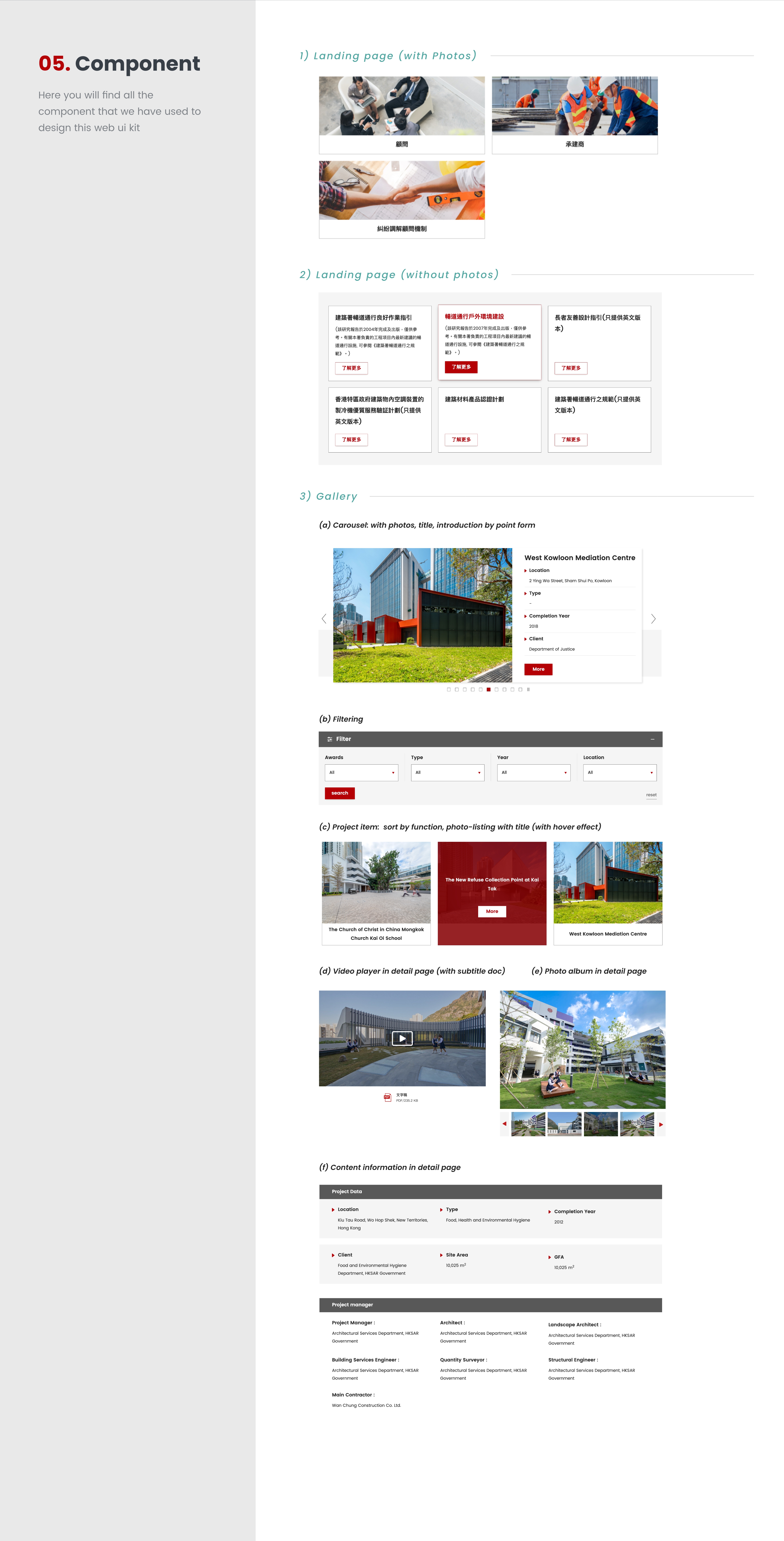
Gallery
Better layout and orientation
The original web page's filter is confusing, and the main projects were not highlighted and were all text-based.
So we redesigned it to put a ''Latest projects'' tab on the page, and introduced the most updated project to their users. There is a “filter below” function to sort with the filters awards, type, year and location. Their users can search for corresponding projects according to their needs easily.
Each project's inner page clearly lists out various details with photo carousel and video players.
The web design complies with WCAG 2.1 & WAI AA.
The design needs to take into account the needs of different users. For example, an audio description of the video should be provided for visually impaired persons.
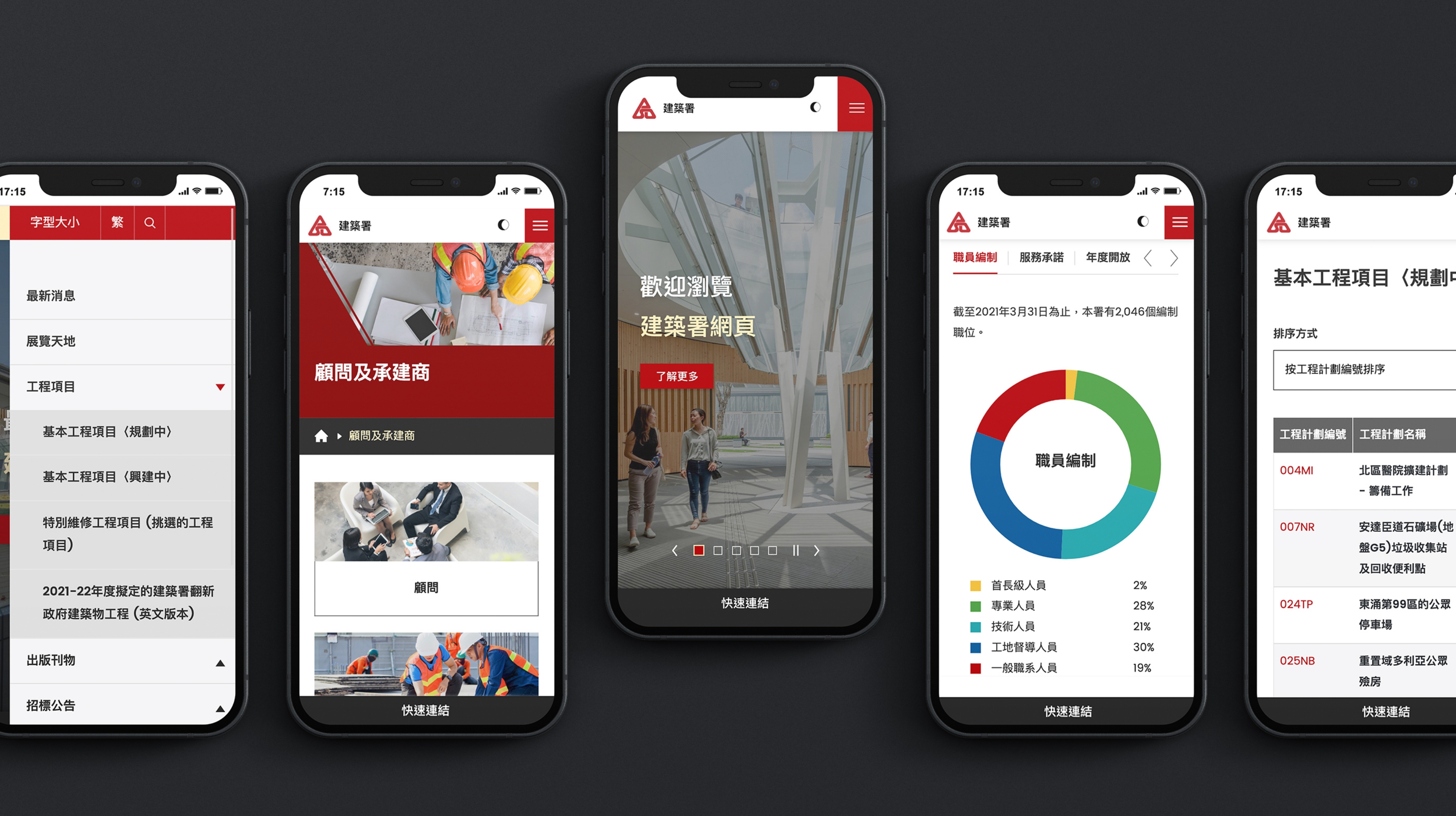
Dark Mode Function
In addition, in order to meet the needs of users, the website is equipped with Dark mode, so that users can read the content clearly, and feel comfortable while reading the site, not hurting the eyes, and helping to prolong the time of staying on the platform.
Charts design of ‘’Staff Establishment’’ and ‘’Organisation Structure’’
Finally, we are a collective effort that helps redesign a website capable of making several significant improvements to the current program of ArchSD. Bring a new user experience to ArchSD and enhance the image of the department.
From the design to the presentation of the web page, it involves the cooperation of different teams, front - end & back - end. After the data entry, the page may be different from the original design, such as the project section of the Homepage. In the development stage, the client wants to increase the displayed items, so the page is slightly longer, which has made the user flow relatively long. I believe we could do better if we had more time for communication and improvement , but overall we are happy with the result.